After many years of using traditional desktop environments like Gnome 2 and KDE and XFCE, I recently spent a few months with Ubuntu 13.04. Overall, my experience with the Unity desktop was fairly positive after I tweaked and configured it to my liking. Since then, I’m using a different non-Ubuntu based distribution, so I’m currently using Mate 1.6. Probably the feature that I most miss from Unity is the launcher. Frankly, I’m surprised that the Unity launcher was so useful and intuitive for me, since I have never been particularly fond of keyboard navigation. Although I still don’t use the keyboard much for window management or within the applications, now that I’m back on Mate I find myself really missing the convenience of searching and launching both apps and files from one unified interface with just a few keywords. With the online results all disabled, Unity’s launcher learns from the user’s habits and quickly becomes uncannily accurate at suggesting relevant local files and applications based on a few letters of input. It really did significantly add to my productivity. The only problem is that the Unity desktop environment, apart from its launcher, is not what everyone wants in a desktop. Additionally, despite a few efforts to port it to other distributions with varying degrees of success, Unity continues to be an option almost exclusively for Ubuntu based systems. So, what other options are available for users who want a launcher like Unity’s, but in a different desktop environment and/or distribution? That’s what I set to find out.
Synapse
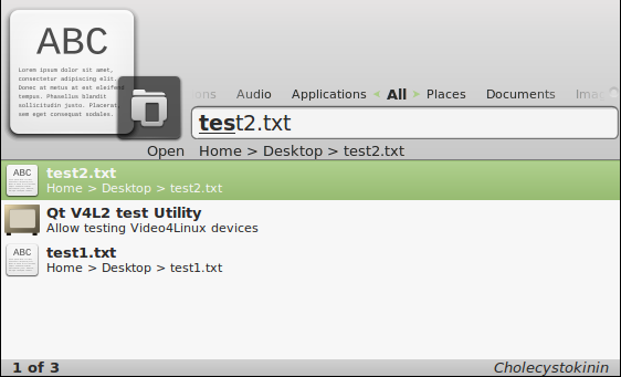
Synapse is a “semantic launcher written in Vala”. It leverages the Zeitgeist Engine, which logs and learns from the user’s usage patterns to make search results more relevant. Here’s what it looks like by default:
Speed and Memory Usage
Synapse feels very fast in general use, even when running on my laptop with its rather slow 1.4GHz ULV processor. Newly created files instantly appear in search results. I didn’t notice any disk thrashing, and it appeared to index my files almost instantly. On a 64 bit system, Synapse itself only uses around 10MB of memory. However, it also depends on Zeitgeist, which runs two processes, zeitgeist-daemon and zeitgeist-datahub. On my test system, Zeitgeist’s memory usage was in the single digits. However, on other production systems that use Zeitgeist, such as Ubuntu or Gnome Shell, I have seen Zeitgeist memory usage climb to around 500MB.
Interface
The left and right arrows can be used to filter search results by specific categories, such as “Applications”, “Documents”, “Video”, and “Internet”, among others. It only shows one top search result, although a list of other matching results are visible by pressing the down arrow. I personally do not like this behavior. I prefer to see a quick overview of all the available options as soon as I start to type, without needing to press any additional keys. Synapse has a great calculator, which shows results simply by typing numbers into the search field, and the result can be copied to the clipboard simply by pressing enter. I don’t like the fact that the actual search query doesn’t actually appear anywhere as it is entered. Rather, it shows the matching characters of the results in bold text. This makes it difficult to know if there are no results for what I am typing, or if I simply made a typo. It doesn’t allow me to search for programs by keywords in their description, such as “browser” or “editor”.
Intelligence
Another major flaw is that Synapse does not learn file usage patterns. A good launcher should remember which files and applications are most frequently used, and offer them first in the search results. Synapse does remember the most frequently used applications, but not files. So if two files, “test1.doc” and “test2.doc” exist on the disk, it will always suggest “test1.doc” first due to its alphabetical weight, even if “test2.doc” is more frequently used. This is the most serious flaw that prevents me from using Synapse.
Development Momentum
The future of Synapse doesn’t look very good. The latest version to date, 0.2.10, was released on February 18th, 2012. There is a long list of mostly unhandled bug reports.
Launchy
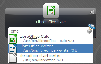
Launchy is billed as “The Open Source Keystroke Launcher”. It supposedly runs on Windows, Mac, and Linux. I say “supposedly”, because I’m mainly interested in using it on Linux. Although it does have a public facing website, it also has some resources on its development pages at Sourceforge. Here’s what it looks like in usage:
Speed and Memory Usage
Launchy is very fast at finding results on my rather slow test laptop. It allowed me to adjust the settings to display search results without any delay, which is my preference. Unfortunately, Launchy does not seem to use any system level notification mechanism to notice new files. Instead, it uses a rather antiquated time-based update interval. The lowest I could set it to was every 1 minute. I wish it wasn’t necessary to wait for it re-scan the directories until it notices new files. Memory usage is low, at around 12MB on my test system.
Interface
Launchy has quite a few options to adjust its behavior.
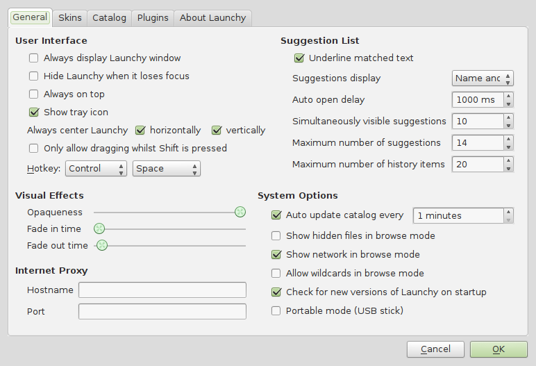
I prefer a scroll-able list of possible options to appear instantly when I start to type my query, which is possible with Launchy. I also like that Launchy clearly shows what I type in a field, and then highlights the matching characters in the filenames and application names. It also has a simple calculator function that works like the one in Synapse. The default Launchy theme looks rather gaudy and dated, as though it belonged in Windows 7 instead of Linux. It offers other skins, but most of them don’t work. For some reason, it often shows the description of programs in other languages different from my system language. And it doesn’t allow me to search for programs by keywords in their description.
Intelligence
Launchy does a good job of ordering search results by their usage frequency, both for applications and file names.
Development Momentum
Development on Launchy appears to have stalled. The current version appears to have been released way back in 2010. There is a list of bugs that have not been handled or even triaged.
Update (19-NOV-2013): Upon finalizing this article, I tried to re-install and re-configure Launchy (version 2.5-3) on two different systems. In both cases with a fresh configuration of Launchy, I had trouble making it index files and display them in the search results. Indexing of several gigabytes of files on my production system caused Launchy to hang up. And I also noticed problems with the search query field losing focus while typing in it. This makes Launchy by far the most buggy and unusable launcher in this article.
Gnome Shell
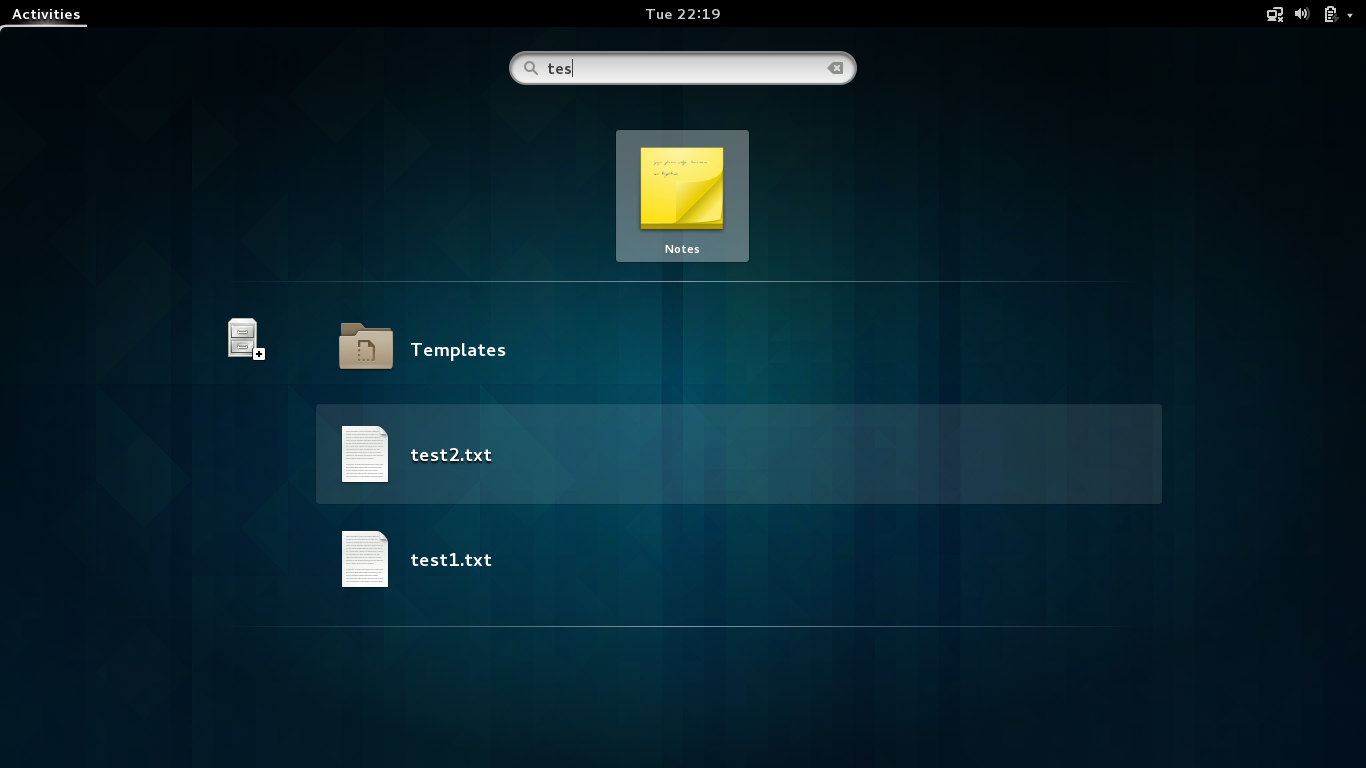
Gnome Shell might not be the first to come to mind in this category, but it actually is the closest equivalent to Ubuntu’s Unity interface. Without reviewing the entire Gnome Shell, I’ll focus mainly on the search capabilities that appear in the Gnome Shell Activities Overview. It looks something like this:
Speed and Memory Usage
The Gnome Shell search function is noticeably slower than the rest of the applications mentioned here. Although in reality it isn’t all that long, the milliseconds of delay that it takes for results to appear on my older laptop are rather distracting. It could be due to the large, higher resolution icons that appear next to all the results. Memory usage is harder to calculate, but since Gnome Shell also needs Zeitgeist for the file search feature, it could potentially consume a lot of memory. Sometimes results appear, but as I continue to type, they disappear and then return again after a short delay.
Interface
The search functionality of the Gnome Shell is well integrated into the overall Gnome Shell experience. The icons for search results are large and attractive. However, a major negative point for my usage pattern is that files are in a lower category separate from applications. This means that if I have a file named “test.doc”, when I type “tes” the “Qt V4L2 Test Utility” will appear first, even if I open “test.doc” more frequently than the Test Utility. An advantage that Gnome Shell has over Unity is the ability to select search results with the TAB key, which is not possible in Unity. The TAB key feels the most natural to me, including when compared with the UP/DOWN arrow keys that the other launchers here use. I also like the fact that many results are presented in grid format while typing the search query.
Intelligence
Unfortunately, Gnome Shell only remembers usage patterns for applications, not files. This is a significant disadvantage of the Gnome Shell, and is a feature that I strongly hope will be implemented in the future. Since it does use Zeitgeist, it should be a trivial code change. Meanwhile, Gnome Shell doesn’t meet my needs for intelligently offering relevant search results consisting of both applications and files from the same unified interface.
Development Momentum
Of all the applications discussed here, the Gnome Shell as a whole is by far the most active project. They release regular bug fixes, and new releases appear approximately every six months.
Gnome Do
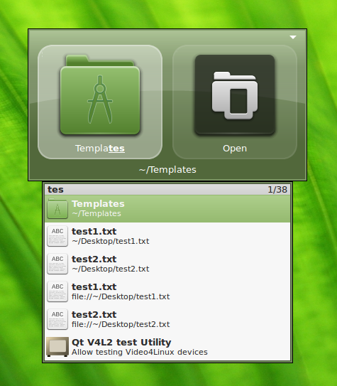
Gnome Do is one of the original launchers for Linux that offers search results for both applications and files with intelligently weighted results. It is coded in Mono. It looks like this out of the box:
Speed and Memory Usage
Gnome Do is very fast to return results. Unfortunately, the speed of Gnome Do comes at the cost of fairly heavy memory usage. On my test system with few files and applications, Gnome Do uses more than 50MB of memory. Additionally, since it is coded in Mono, it is a very heavy installation. I don’t use any other Mono applications on my system, and indeed I prefer to avoid them because of the complex and heavy Mono dependencies. To install Gnome Do, the total download was almost 50MB, mostly consisting of Mono dependancies, and the deflated files used a whopping 200MB on the filesystem. Therefore, Gnome Do is by far one of the largest and most complex launchers currently available.
Interface
There is a configuration option under the “Appearance” tab to “Always show results window”. This is my preference, and it instantly displays a list of possible matches as soon as the user begins to enter a query. Unfortunately, there seems to be a bug where files are displayed twice with two different prefixes. For example, “test.txt” appears with the prefix ~/Documents/test.txt and another duplicate with the prefix file://~/Documents/test.txt. Gnome Do is supposed to have a calculator plugin, but I can’t figure out how it works. I also don’t like how there is no field that shows the search query being typed. Instead, it only shows the matching characters in the names of the results. I often make typos, and it makes it difficult to see which character I typed was a mistake. Gnome Do has a nice feature of offering many options apart from simply opening the file or application. After selecting the desired search result, a TAB over to the next square brings up another dropdown menu with additional actions, such as opening the containing folder of the file, renaming the file, copying, and opening with a different application, among others.
Intelligence
Gnome Do does a good job of intelligently learning the users habits for both applications and documents. Unfortunately, the additional actions accessed through the TAB key are not intelligently ordered by usage frequency.
Development Momentum
Development of Gnome Do unfortunately appears to have died off. Version 0.9 was released on March 4th, 2012, and there is a long list of unattended bugs. Undoubtedly the development focus is now placed on Gnome Shell.
Kupfer
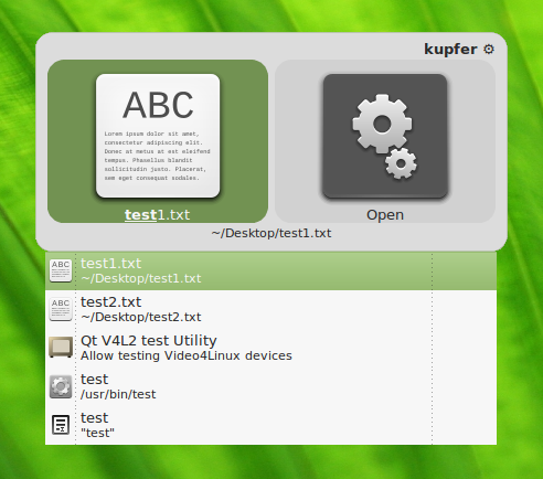
Kupfer has been around since 2007, according to the credits. At first glance it seems to have been inspired by Gnome Do; nevertheless, an old FAQ states that the Kupfer project was started before Gnome Do ever existed. Rather, it openly claims to have been “heavily inspired by Quicksilver”, which is a popular launcher for Mac OS X. Kupfer is written in the Python programming language. Here’s a look at Kupfer in action:
Speed and Memory Usage
Kupfer is fairly lightweight. It only takes about 3 MB of disk space when installed. It has no complex dependencies. Memory usage starts at around 23 MB on a fresh install without much indexed data, but on my production laptop it was using around 80 MB of RAM after a few days of usage. Speed is very good with practically instantaneous search results, which is probably owing to cached indexes in RAM.
Interface
Kupfer has a simple and attractive interface, consisting of two side-by-side squares. A press of the down arrow in the left square before starting a search allows filtering of search result categories. A tab over to the right square and another down arrow allows different actions to be performed on the selected search result. A significant downside to the Kupfer interface is that by default it only shows one top search result in the left square. I personally like to see a list of possible matches so I can get a bit more context for the search results. It is possible to arrow down after beginning a query to see the list of search results, but for me that’s one keystroke too many. Fortunately, an extremely helpful developer gave me a few lines of code to tweak the behavior to automatically display the vertically scrollable list of search results. Since Kupfer is written in Python, I simply manually changed the lines of code to apply the tweak, and no re-compiling or re-packaging was necessary. Apart from this, I generally like the Kupfer interface, with a few caveats. Kupfer is extremely powerful, allowing file management actions from the right square, such as moving, copying, and renaming files, as well as opening their parent folder. There is also a way to do quick calculations in Kupfer, but it requires a lot of keystrokes and is not very intuitive for me yet. There is even a clipboard history, which again feels slightly complicated when compared with clicking on a clipboard tray icon. I don’t like the semi-transparency of the default theme, since the text of a document in the background conflicts with the text being displayed in Kupfer. There is a somewhat un-intuitive way of disabling transparency— enable the “Custom Theme” plugin and use the “Square” theme, which is simple, clean, flat, and has no transparency.
Intelligence
Kupfer does a good job of ranking search results by frequency of usage. Applications and files are correctly mixed together in the search results and ranked by usage frequency. I personally want my entire home directory to indexed without specifying every single folder. This requires changing a very obscure setting in the config file: After shutting down Kupfer, In the ~/.config/kupfer/kupfer.cfg file, add a section that looks like this:
[DeepDirectories]
depth = 999
direct = ~/
Now Kupfer will automatically index files at any level of the home directory, including deep inside nested directories. There is a small flaw in Kupfer’s indexing system: It immediately indexes new files that are created via the usual GUI methods such as File->Save in an application, but it does not notice new files that are created at a lower level. For example a file created by the command touch ~/Documents/something.txt would not be found by Kupfer until after restarting Kupfer. This normally doesn’t present a very big problem, since almost all files on a desktop system will be manipulated via the GUI interface. But, it would still be nice if Kupfer used a low-level file notification system that some of the other launchers here use. I also don’t like how Kupfer automatically clears the search query if there is a pause of a few seconds without typing. This makes me feel rushed to type my query before it gets erased. Likewise, I wish Kupfer had a query entry field that shows exactly what I type, instead of just highlighting the matching characters in the filename with blind entry of the query.
Development Momentum
Kupfer development does not exactly appear to be thriving. The main Kupfer homepage is no longer functioning. However, I have received very helpful and prompt support from a developer on Kupfer’s Launchpad listing. A developer there helped me with support questions and resolved bugs in a very professional way.
Conclusion
My hope is that this overview of currently available launchers will encourage use and development of these convenient tools. I know that I am not the only computer user that still heavily depends on a launcher for many common tasks. My personal preference at the moment is Kupfer, and I highly recommend that you try both Kupfer and the other options mentioned to here to find a powerful launcher that best suits your workflow. Please feel free to mention any corrections or alternatives in the comments section below.